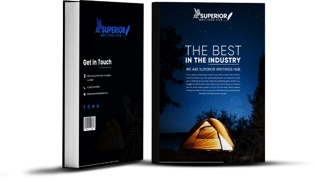
Two books sit side by side on Amazon: same genre, similar plot, equally well-written. One sells thousands of copies while the other barely moves. What’s the difference? The cover that makes people stop scrolling and click.
Do you know that you have only 1.7 seconds to grab someone’s attention before they move on to the next option? That’s faster than it takes to blink twice, so your cover needs to convey both the genre and the quality of your book.
Most authors spend a year crafting the perfect manuscript, but treat the cover like an afterthought, and wonder why their masterpiece remains invisible while mediocre books with bestselling book covers rack up sales.
Every author needs to understand that great book cover designs are not just pretty pictures; they are much more than that. Having said that, read on to know how to design the perfect book cover to make it sell more.
Why Your Brain Falls for Certain Covers
Ever notice how you can spot a romance novel from across a bookstore? That’s not magic—that’s psychology being weaponized by innovative publishers. It’s colors that attract your emotions. Warm pinks and golds whisper “happily ever after,” while cold blues and grays scream “trust me, I’m serious business.”
They’re basically visual pheromones for readers who want to fall in love. Clean, blocky fonts on business books signal “I’ll make you rich and respected.” The book cover designs understand something crucial: readers decide with their gut, then justify with their brain. That emotional hit has to happen first, or you’ve already lost them to the next thumbnail in their feed.
What Actually Makes People Click Buy
Conversion is not about winning design awards; it’s about triggering the correct response in people who are tired and scrolling through hundreds of options. T
he covers that make money follow some unspoken rules that nobody teaches in art school.
First rule: clarity always wins over creativity. If someone can’t figure out what your book is about while squinting at their phone screen, you’ve lost. Most people discover new books on mobile devices, which means your cover needs to be effective at postage stamp size.
Second rule: genre expectations are not suggestions, they’re requirements. Readers have been trained to associate particular looks with specific experiences, and breaking those associations usually confuses people.
Making Covers That Stop the Scroll
Eye-catching book covers need what marketing people call “stopping power,”that magical quality that makes someone pause their mindless scrolling. Sometimes it’s a color that pops against everything else on the page. Sometimes it’s an image that makes you do a double take.
Keep in mind that weird doesn’t always equal effective. You want people to stop and understand what they’re looking at. The goal is to intrigue them just enough to click through and read your blurb.
When to Call in the Professionals?
DIY cover design tools are everywhere now, and some authors create decent covers themselves. But there’s a reason successful authors eventually hire a professional book cover designer: it’s usually cheaper than the sales you lose with amateur-looking covers.
Good designers bring more than just Photoshop skills. They understand market positioning, genre conventions, and the technical requirements that trip up authors. They also have access to professional stock photography and custom illustrations that are far beyond what most authors can afford individually.
The best designers ask uncomfortable questions about your target audience and comparable titles before they even start sketching. If someone wants to make you something “pretty” without understanding your market, keep looking.
Self-Publishing Reality Check
Self-publishing cover design is fierce because you don’t have a traditional publisher’s marketing machine behind you. Your cover is your entire marketing campaign, so it had better be great.
The mistake most self-published authors make is thinking they can cut corners on covers and make up for it with great content. People need to discover your book before they can appreciate your brilliant writing.
Testing Before You Commit
Competent authors test their book cover designs before making final decisions. Social media polls work surprisingly well. Post a few options and see which ones get more engagement. Facebook groups for your genre can provide brutal but helpful feedback. Some authors even run cheap Facebook ads with different cover options to see which ones get better click-through rates.
The results might surprise you. Sometimes the cover you hate performs best with actual readers. Remember: you’re not buying the book, they are.
Avoiding the Biggest Mistakes
The covers that tank conversions usually make the same predictable mistakes: cluttered designs that try to cram everything into one image, text so small it disappears at thumbnail size, and generic stock photos that show up on twelve other books in your genre.
However, the biggest mistake is falling in love with covers that appeal to you rather than your readers. Authors who insist on covers they love, regardless of market realities, often struggle with sales. Your opinion matters, but your readers’ wallets matter more.
To Sum It Up
Your cover is competing against thousands of others for attention from people who have infinite options and short attention spans. It needs to work harder than ever before, and “good enough” is no longer good enough.
Book cover ideas that sell are a combination of market research, psychology, and sales strategy rolled into one visual package. Successful authors invest in getting it right because they know everything else depends on that first crucial impression.
Your book might be the next bestseller, but only if people pick it up. Make sure your cover gives them every reason to do precisely that.