It is often said that you should never judge a book by its cover, but the reality of the publishing industry tells a completely different story. According to recent consumer data from Nielsen BookData, the front cover directly influences over 13% of all book purchases in the UK a number that rises significantly for impulse buys and in-store discoveries.
In today’s incredibly crowded market, your book cover is your hardest-working marketing asset. It has precisely three seconds to capture a reader’s attention, communicate the genre, set the emotional tone, and promise a rewarding experience. And crucially, it must do this in two vastly different environments: as a tiny, 100-pixel thumbnail on Amazon or a TikTok screen, and as a physical, tangible object resting on a display table in Waterstones or Foyles.
As we move through 2026, the aesthetics of UK book publishing have evolved. Readers are demanding more visual sophistication, moving away from hyper-polished clichés and embracing bold, artistic, and highly intentional design. Whether you are a traditionally published author, a self-published indie writer, or a designer looking to capture the British reading market, understanding these shifts is essential. Here is your comprehensive guide to the trends and tips for crafting an irresistible book cover for UK readers.
The State of UK Book Cover Design in 2026
The UK book market has historically favoured slightly more restrained and subtle designs compared to the high-octane covers often seen in the US. However, digital globalisation and the undeniable influence of “BookTok” have blurred these lines. British readers are now gravitating towards high-impact visual statements.
Today’s readers do not approach covers with a blank slate; they approach them with established expectations. The goal of modern cover design is no longer just to “look pretty” it is to effectively signal the genre while simultaneously subverting expectations just enough to feel fresh. We are seeing a powerful pushback against synthetic perfection and generic stock photography, replaced by an embrace of bespoke illustration, structural typography, and clever use of negative space.
Let us break down the specific visual trends currently dominating the UK charts.
Top Book Cover Design Trends Dominating the UK Market
1. Typography as the Main Event
Typography is no longer just the vehicle for delivering your title and author name; it has become the central illustration. In 2026, designers are treating text as a structural, architectural element.
We are seeing covers where a single, massive typeface eats up 80% of the visual real estate, leaving absolutely no room to whisper. This trend is incredibly effective because it immediately solves the “thumbnail problem” massive text is legible on any screen size.
Beyond sheer size, typography is becoming interactive. In genres like science fiction, dystopian, and thriller, text is being warped, distorted, stretched, or made to appear three-dimensional. Letters might bubble outward, hide behind subtle foreground elements, or feature aggressive, harsh textures. By mixing elegant serifs with stark sans-serifs, designers can instantly convey mood and genre tension before the reader has even glanced at the blurb.
2. Explosive Contrast and Saturated Hues
For years, certain genres relied on subdued, moody colour palettes. Thrillers lived in a world of shadows, whilst literary fiction favoured muted, earthy tones. That era is fading. Today, contrast is doing the heavy lifting, and colour is being used aggressively to force clarity.
This trend originated in contemporary romance which proved years ago that bright, saturated colours sell but it has now infiltrated almost every genre. Even dark, gothic thrillers or crime novels are now relying on sharp injections of jewel tones (think vibrant emeralds, deep sapphires, or striking neon pinks) set against dark backgrounds to draw the eye. Flat, low-contrast covers simply struggle to survive in digital storefronts. A bold, high-intensity colour palette acts as a visual anchor, signalling energy and confidence.
3. The Power of “Editorial White”
Conversely, amidst a sea of hyper-saturated and dark covers, the strategic use of stark white space has become a massive trend in the UK market, particularly for non-fiction, contemporary fiction, and upmarket thrillers.
White works exceptionally well because it removes visual noise and forces absolute focus onto a single graphic element or title. On a crowded digital search page filled with dark, busy thumbnails, an expanse of white stands out immediately. It signals an editorial, curated, and confident tone. These covers are not minimal because they lack ideas; they are minimal because the central idea is strong enough to stand entirely on its own.
4. Illustration Over Photorealism
With the rise of AI-generated imagery flooding the market, there is a distinct, deliberate pushback from UK publishers and readers against aesthetics that feel synthetic or “too perfect.” Readers are craving the human touch.
As a result, we are seeing a massive resurgence in traditional art styles. Painterly textures, visible brushstrokes, textured digital paintings, and mixed-media collages are highly sought after. These styles suggest rather than explicitly explain, leaving space for the reader’s imagination. This shift is particularly prominent in historical fiction, fantasy, and literary fiction, where a beautifully crafted illustration feels more timeless and emotionally resonant than a heavily photoshopped composite image.
5. Symbols Speak Louder Than Characters
Historically, it was common to feature character models on the front cover the lone figure walking away in a thriller, or the photorealistic couple in an embrace on a romance novel. In 2026, the industry is largely pivoting towards symbolic objects.
Readers often prefer to imagine the characters themselves. Providing a highly specific photograph can disrupt their personal connection to the story. Instead, designers are utilising key symbolic objects that represent the core of the narrative. A pair of elegant teacups for a domestic drama, a blood-spattered pocket watch for a historical mystery, or intertwined botanical elements for a romance. Symbols are cleaner, visually striking, and cross cultural boundaries much more effectively than character models.
Designing for the “Dual-Scale” Experience
One of the most critical concepts for authors to grasp today is that a cover must do two entirely different jobs simultaneously. Designing for only one context is a losing strategy. You must master the “Dual-Scale” approach.
Winning the Thumbnail Click
First, your cover must win the digital battle. When reduced to the size of a postage stamp on a mobile phone, intricate details vanish. To stop the endless scroll, the cover must rely on its fundamental structure:
- Big, bold shapes (geometry, circles, grids).
- Clear visual hierarchy (your eye should know exactly where to look first).
- High contrast between the background and the typography.
If your cover becomes a muddy, illegible blur when scaled down to 10% of its size, you will lose countless digital sales, regardless of how beautiful the art is up close.
Rewarding the Physical Reader
Second, the physical book must justify its purchase. When a reader walks into a UK bookshop and picks up your paperback or hardback, the cover needs to reward that physical interaction.
This is where the fine details the things that don’t matter on a screen become the stars of the show. UK publishers are heavily investing in tactile finishes to make physical books feel like premium, collectible objects.
- Foil Stamping: Using metallic foils for titles or subtle background elements to catch the bookshop lighting.
- Embossing/Debossing: Raising or sinking elements of the cover to provide a physical texture.
- Spot UV: Applying a glossy varnish to specific matte areas (like the title or a symbol) to make it pop.
- Sprayed and Stencilled Edges: Customising the actual page edges of the book to match the cover design, a trend that has exploded in popularity amongst fantasy and romance readers.
The structure wins the digital click; the tactile details win the physical purchase.
Essential Tips for Authors Targeting UK Readers
If you are preparing to launch a book in the UK, keep these strategic tips in mind during the design process:
1. Master Your Genre Signalling
Readers do not buy books blindly; they browse looking for specific emotional experiences. Your cover must immediately communicate its genre. If you have written a light-hearted romantic comedy, your cover should not feature the sharp, metallic typography and moody lighting of a psychological thriller. Study the top 20 bestsellers in your specific sub-genre on Amazon UK and in physical stores. Identify the visual tropes the fonts, the colour palettes, the types of imagery and ensure your cover speaks that same visual language, while still retaining its own unique identity.
2. Prioritise Your Author Branding
A common mistake made by debut or self-published authors is making their author name far too small, under the assumption that because they are not yet famous, their name does not matter. This is a crucial error. Treat your author brand with confidence from day one. A well-placed, clearly legible author name signals professionalism and sets the foundation for brand recognition. If a reader loves your first book, they need to easily recognise your name on the spine of your second.
3. Invest in Professional Typography
If you are working with a tight budget and must choose between spending money on bespoke artwork or high-end typography, choose the typography. An incredible piece of art can be entirely ruined by cheap, poorly placed, or unkerned text. Conversely, a brilliant typographic treatment can turn a simple, inexpensive background colour or stock shape into an award-winning cover. Typography is the architecture of your book cover do not cut corners on it.
4. Consider the Spine and Back Cover
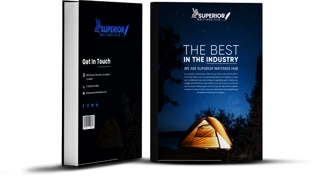
While the front cover draws the reader in, the spine and back cover close the sale in a physical retail environment. In many UK bookshops, space constraints mean books are displayed spine-out. Your spine must be easily readable from a few feet away, featuring strong contrast and a clear hierarchy between the title and author name. The back cover should be uncluttered, leaving plenty of breathing room for the blurb, endorsements, and the barcode.
Final Thoughts: Your Cover is Your Best Investment
In the fiercely competitive landscape of UK publishing, an “okay” cover is simply not good enough. Your cover is the packaging for your hard work, the first handshake with your potential reader, and the deciding factor in whether your book gets picked up or passed over.
By embracing the shift towards bold typography, high-contrast colours, symbolic imagery, and the vital importance of dual-scale design, you can craft an irresistible cover. Whether your reader is scrolling through their phone on a rainy morning commute or browsing the quiet aisles of their local bookshop, a meticulously designed cover ensures that your story gets the attention it truly deserves.